Minimalist Design Trends – The next generation of web design
Minimalism, simplicity and flexibility – many articles seem to agree on these key words to describe the next ‘trendy’ design in 2014. But how are they different from last year? If ‘go simple’ was already trendy last year, we want to take an even more minimalist approach this year. The key difference is that what used to be ‘trendy’ last year will be a ‘must’ this year. So, minimalist design trends will dominate from now on.
2014 is the year of….
- More and more responsive – Last year, responsive design became highly favoured. This year, responsive will become a must, simply because the number of people using smartphones and tablets continues to soar. So it is a perfectly logical move for any website to go ‘responsive’.
- More full-screens – We saw more websites with full-screen backgrounds last year. This trend will be likely to continue, as big images are eye-catching and deliver clear messages to the audience.
- More grid-style design – Pinterest, the pioneer in grid-style digital design, features visually pleasing and simultaneously easy-to-read content. This doesn’t mean the trend is strictly limited within social media. We will see more websites starting to incorporate ‘grids’ style, simply because the consumers like that way.
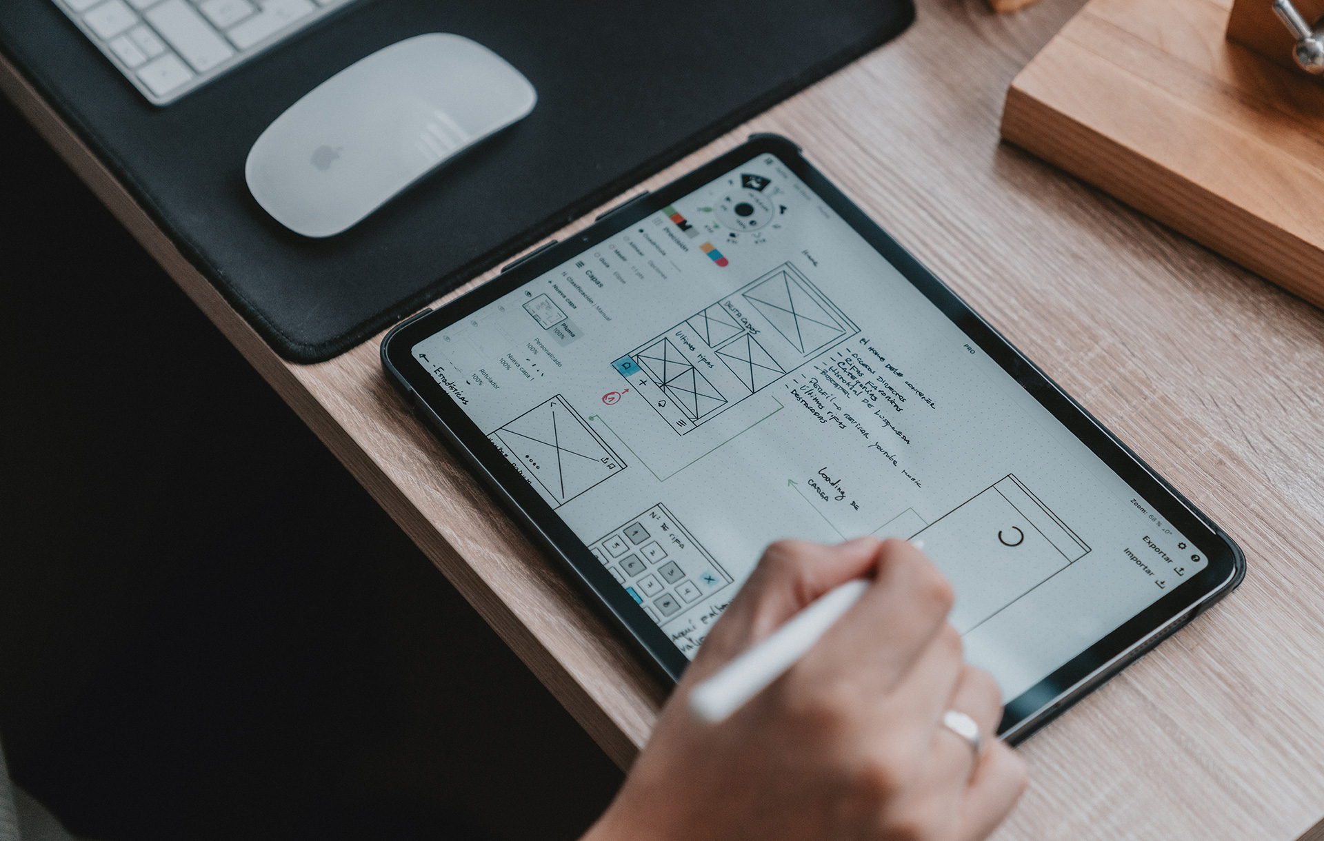
- More focus on flat design – This is simply because of the popularity of easy and simple UX interface. Having removed intricate patterns and textures, a strong stress is on simplicity. Flat buttons and texts, using bright colours and natural shadows, appear to be more interactive.
- More elaborate and artistic images – Visuals will continue to be ‘manipulated’ and ‘filtered’ – blurred, rustic and vintage feel – to tell the stories behind the brand, company and product.
- More fun typography – 2014 will see more diversity and personification of fonts. The viewers’ will no longer have to suffer from reading the standardised fonts all the time, as new fonts will become more affordable and more diverse. Fonts with individuality will never bore the audience. From now on, fonts themselves will embody some kind of story.
- Simpler rel=”noopener noreferrer” content – TNW predicts more and more simplified web content to be dominating the trend in 2014 and onwards. The web layout reminiscent of Twitter will feed the viewers with shorter and focused version of news content. While a long and wordy web content will become more difficult to obtain people’s attention, shortened and simpler content allows what the viewers to ‘scan’ what they need to know in the most effective way.
- What’s the reason behind these?
Three words, ‘Less is more’.
Let’s face it, a website over-represented with texts and images is far from appealing. Most of time it just ends up losing the viewers’ attention and patience. On the other hand, minimalist approach allows a design that is eye-catching, and easy to navigate, and the audience will never get lost.
The question is what is triggering the emergence of minimalist design trends? Whatever the colours they use on the website, they are meant to convey some sort of messages. And there are colours that pull out certain memories from you, whether consciously and subconsciously. Certain colours are associated with certain events, or tangible objects. So use of straightforward, simple and bright colour will click particular part of your brain that finds the link between you and the object/product. This will make your decision-making process quicker and more effective.
On the other hand, a complicated design and layout, with full details tend to confuse people, triggering the feel of loss, distress, and loss of control. You probably want to avoid a website that overwhelms the viewers. So minimalize the web design/content to establish ‘physiological’ connection with the audience more directly and effectively.
To conclude (and to simplify), simple design will create space for interaction and creativity. Minimalist design trends are more effective and functional. So why don’t you let the beauty of minimalist web design entice your audience this year?
Subscribe To Us
Contributors
Categories

This website uses cookies so that we can provide you with the best user experience possible. Cookie information is stored in your browser and performs functions such as recognising you when you return to our website and helping our team to understand which sections of the website you find most interesting and useful. Third party cookies such as Google Analytics is also used on this site to provide analytics in order to better understand the user engagement on our site.
You can adjust all of your cookie settings by navigating the tabs on the left hand side.
Strictly Necessary Cookie should be enabled at all times so that we can save your preferences for cookie settings.
If you disable this cookie, we will not be able to save your preferences. This means that every time you visit this website you will need to enable or disable cookies again.



0.Comments