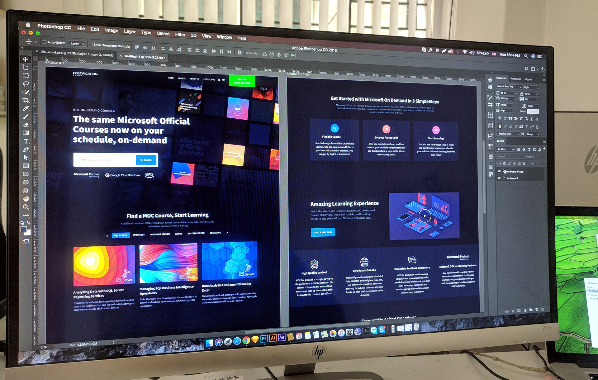
Infographic of the Week: Web Development in 26 Steps.
Web development in 26 steps
Deconstructing your needs and wants
Have a new business? Need a new website? Or you just want to update your current one? Nothing is more exciting than greeting new clients and talking about their innovative business ideas.
But sometimes our simple (and innocent) questions tend to lead to confusion. Questions as simple as ‘what are your purposes and objectives?’ could often result in some vague answers.
There is nothing surprising about that as it can be quite difficult (and time-consuming) to consolidate and prioritise complex business ideas.
For every client who visits us for a brainstorming session, we throw ‘why’ questions to identify the issues and problems they are facing. It’s not that we enjoy testing and bullying start-ups (because we are not a mean, giant corporation). We don’t want to be a constant annoyance either.
But we still ask some basic questions, simply because we want to have a deeper understanding of our clients. And having profound insights into the clients’ needs / problems is always the key to help them achieve their objectives.
Almost everyone thinks that websites are a ‘must-have’ for any business. But it doesn’t mean that your company website has to have the identical features as your competitors’.
As we always say, whether it is an eCommerce, corporate website or social media, there is no such thing as a one-size-fits-all digital marketing solution. Instead, our bespoke solution focuses on the experience and usability of end-users – i.e., target audience.
“Simplicity is the ultimate sophistication.’’ – Leonardo Da Vinci
While it is not so easy to summarise what you do / sell in one paragraph, it is also worth noting that users and visitors are most likely to skim through online content. Trust me, nothing more tiring than watching an interface crammed with excessive information and too many graphics.
An overwhelming and confusing website is the last thing your time-pressed readers want to see. But at the same time, a boring web design will also likely to lose your readers’ interest.
So your sitemap, copy and call-to-action will need to be as succinct and clear as possible. We think simplicity and minimalism are the key to a truly engaging website. The bottom line is that your website is there to foster effective communications with your audience.
So this infographic helps you prioritise your thoughts and prepare for making the right and relevant decisions.
Each step, representing the basic feature of a website, is also very much interrelated to your business branding, organisation and objectives.

Image Source : Pixaal.com
What do you think?
Appnova is a digital agency specializing in web design, UX, eCommerce, branding, digital marketing and social media.
Keep following us on Twitter @appnova and “like” us on Facebook for useful news and tasteful digressions about geeky stuff.
Subscribe To Us
Contributors
Categories
Subscribe To Us
Contributors
Categories

This website uses cookies so that we can provide you with the best user experience possible. Cookie information is stored in your browser and performs functions such as recognising you when you return to our website and helping our team to understand which sections of the website you find most interesting and useful. Third party cookies such as Google Analytics is also used on this site to provide analytics in order to better understand the user engagement on our site.
You can adjust all of your cookie settings by navigating the tabs on the left hand side.
Strictly Necessary Cookie should be enabled at all times so that we can save your preferences for cookie settings.
If you disable this cookie, we will not be able to save your preferences. This means that every time you visit this website you will need to enable or disable cookies again.


0.Comments