Summary
Appnova helped CIPD re-design its membership renewal interface. Our UX team came up with a clean user interface encompassing a simpler navigation path, with clearer calls to action, in order to reduce drop-outs and, in turn, maximise conversions.
Our Client
The Chartered Institute of Personnel and Development (CIPD) is a professional association for human resource management professionals. Since its establishment in 1913, the CIPD has been the leader in providing knowledge and expertise in this specific field. It offers globally recognised HR qualifications for professionals in public and private sectors. Today, the CIPD has more than 130,000 members and is Europe’s largest network of HR professionals.
Having visited our portfolio, CIPD asked Appnova to help them revamp the look and feel of its complex membership renewal system.
Challenges
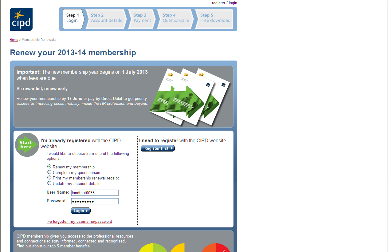
Registered CIPD members are required to renew their membership status online on a yearly basis. However, CIPD’s previous membership renewal system often caused confusion amongst the users due to an outdated and inconsistent user interface design.

(CIPD’s old membership login page)
Whether it is an e-commerce website or company website, thoughtful UX design is one of the most decisive factors that attracts and motivates users. An outdated UX pattern, on the other hand, tends to make visitors feel confused and frustrated.
Strategies & Solutions
In order to solve its complex design problems, our strategists developed a tangible solution with a strong focus on the user perspective.
- Quick and easy membership renewal
- Easy-to-navigate structure
- Mobile-responsive and tablet-optimised interface
We structured the following features using a clear visual hierarchy.
- Sign-in page
- Membership details
- Payment options
- Questionnaires
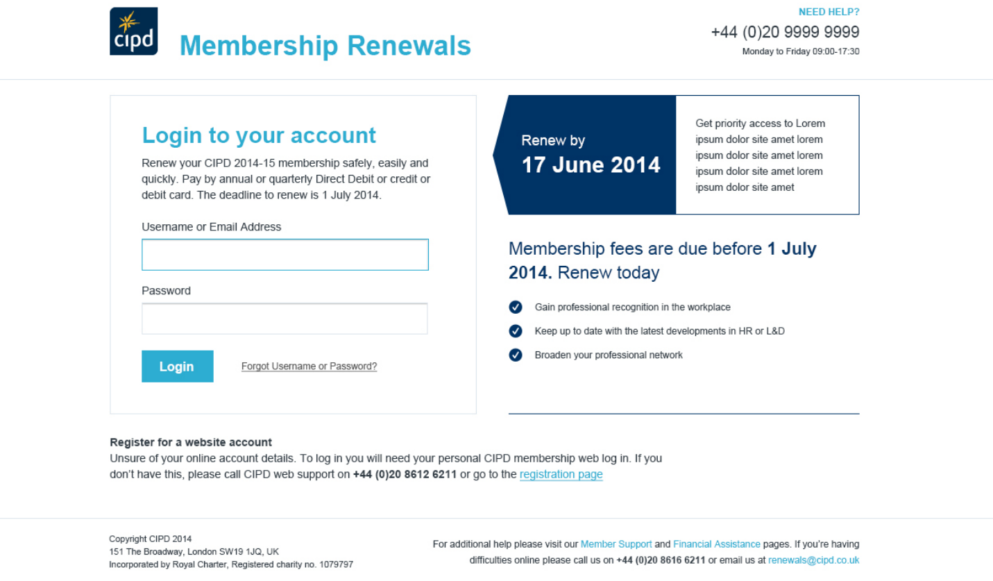
Despite the complex system, we presented a mobile-friendly UX design with simple steps to follow. The new membership renewal system allows the users to choose from different types of membership and payment method very easily.

(New membership renewal page)
Final Thoughts
We think that a clean and modern membership renewal site is important to convey CIPD’s professionalism. CIPD’s previous membership renewal system was not able to guide users efficiently throughout the process. In addition, its interface design needed to be up-to-date to serve mobile and tablet users.
It is always nice to go into a grocery store with a simple shopping path that naturally takes you from vegetable to wine section. This should be the same for websites and e-commerce sites. Customers visit a website with clear purposes in mind. A bad UX design, on the other hand, can easily make them feel lost in a maze.


0.Comments